Showing posts with label Herrbergquist. Show all posts

Sunday, 28 April 2013

AT EASE IN DUNGAREES

                                                 Orange Overall

Spending my weekend in dungarees made me wonder what designers does men`s overalls these days?
This slouchy vintage cotton canvas version is the perfect garment to loosen up with funny games in the countryside.

Ever since Marky Mark made them infamous in the period of his iconic CK ads they have only appeared occasionally on the catwalk from designers such as Ralph Lauren and Marc Jacobs to name but a few.

FASHION IN MOTION from my favorite spot in the garden.  Vibrant orange looks striking against the clear blue sky.


Vintage cotton canvas Dungarees, Uniqlo plaid flannel shirt, silver and orange Adidas sneakers.

Monday, 22 April 2013

Interview: Richard Haines


                                                Richard Haines - WHAT I SAW TODAY


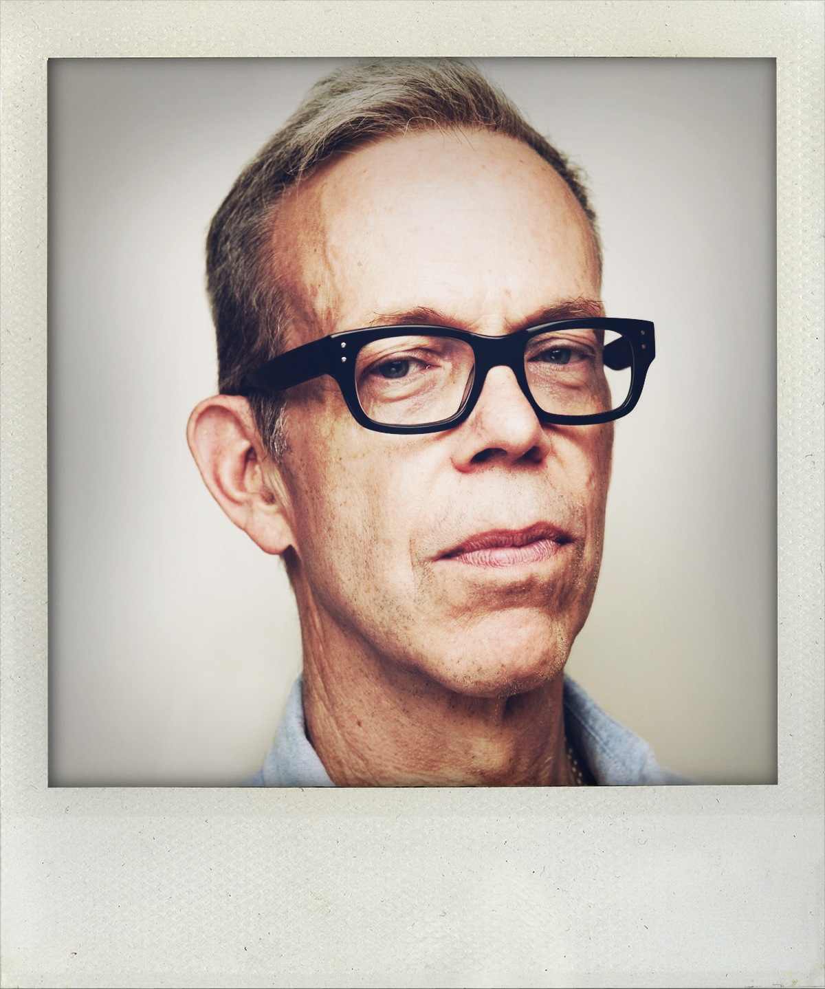
Richard Haines captured by Michael Adolfsson & ´WAS A LITTLE COOLER THIS MORNING´, Wednesday August 27, 2008.


When browsing through Richard Haines blog "What I saw Today" I get impressed by the way he uses his eyes and pencils to create instant drawings - looking like they were sketched with the speed of a camera lens. I see a striking resemblance to artist Egon Schiele with his compositions, subtle color sense and in the beautiful way he captures movements. You may have seen him at The Selby or some of his collaborations with the likes of London Sunday Times, J Crew, In Style Magazine or Prada to mention a few.
Get inspired from his humble and thoughtful answers to my questions and by viewing a small collection of his work! For more, visit his blog here

Herrbergquist: What has been your proudest moment so far in your career as an illustrator?


Richard Haines: There have been many proud moments. I think overall I was very proud and happy when I realized I could make enough money from my art to pay my bills - that was pretty major.
Once when I first started the blog I was in a store with my daughter and someone came up and asked if I was Richard Haines, and they loved my work. My daughter and I were pretty stunned and it was a great moment because I wanted my daughter to see that I could rebuild my life and do something I really loved.

"IL PALAZZO" A BOOK OF ILLUSTRATIONS COMMISSIONED BY PRADA, 2013

Q: Tell me about your favorite collaboration?

A: There have been a lot of great collaborations - each in different ways. The people at J Crew really gave me my first big opportunity, so that was amazing. And working with Prada was fantastic. They both are different companies but have the same level of commitment and intelligence to what they do. I feel fortunate to work with companies like that.

Q: Do you have a favorite drawing from your archives?

A: I have a few that I really like looking at - and they are very atmospheric. One is two guys walking in Bushwick at around 4:am. Another is of a guy walking through the snow. They remind me of certain moments in time, and have certain memories, which is why I enjoy them. 

Q: When did you start drawing men in their outfits in the streets?

A: I am not sure when exactly. I was designing men`s clothes before I started the blog and switched careers to become an illustrator, so it`s something I´ve done for a while.
When I started my blog I originally was thinking of making it a kind of men`s fashion report - a trend report for menswear, but then there was so much I saw on the streets that it became easier to just draw what I saw instead of put things together as stories. It think it`s a really interesting time in menswear, and I am glad to be documenting it.


´AND NOW SOMETHING MELLOW´, thursday september 4th, 2008 & ´WHAT I AM LOVING NOW´, Sunday April 25, 2010

Q: What do you find inspiring?

A: I´ve always been really excited by pop culture - starting when I was a kid with the beginning of music like Rolling Stones, Warhol, the "mod" look.... and I find living in Brooklyn gives me the same kind of excitement - I love seeing new ways people put them selves together, new restaurants, parties, hearing new music. It fascinates me, and drawing it is a way of recording it, of processing it and capturing it.


Q: What is a day in the life of Richard like?

A: Well nothing really starts without coffee, so after that it´s pretty standard - answer work and personal emails, spend too much time on facebook, instagram etc. Then I usually have an illustration job I´m working on, so I tackle that while I have the best natural light in my studio. 
If I´m not working on a specific job I like to go out and explore - maybe meet a friend for lunch, check out a new store, and then inevitably see someone I´ll want to draw, so that will bring me back to my studio.
Evenings I like to see my daughter, or friends for dinner, or maybe occasionally an event or opening. If I stay I´ll watch a movie on netflix or hulu+. There are so many movies we have access to now - it`s endless...


´HOMECORE MONDAY´, January 28, 2013 & ´WHAT`S THAT OLD RULE OF THUMB´, Friday March 27, 2009

Q: You seem to have a very keen eye for men`s fashion - what is your favorite piece of garment from your own closet?

A: Right now I`m really into Acne Jeans. The cut is just perfect - I feel great whenever I put them on. I have a few pairs of slippers form Stubbs & Wootton - they´re very glamorous. I think my all time favorite pair of Church suede wingtips I got around 1981. I still love wearing them - it`s a testament to good design and quality!


                                            ´THE BOYS OF BUSHWICK´, Friday April 29, 2011

Wednesday, 17 April 2013

MY BOY LOLLIPOP

                                                                                 UNDER THE PINK
                                                    Maybe I was not wrapped in a blue baby blanket when I was born?
The rosa study of our house is the habitat of my inspiration. 
I admire the many variations of pink in the architecture spread around Oslo. I love how the saturation of pink was caught in a cinematic light on a glowing afternoon, creating a perfect backdrop for a self portrait.
Loving the rosa typography found on covers from my piles of magazines. Vogue Hommes Spring-Summer -99 dressed in Fuchsia fonts and L`Uomo Vogue December -98 embellished with flamingo.

As a "pink-collar worker" I wear my favorite pink Bottega Venta suit pants with a pin stripe Levis Strauss shirt at my desk with pride. Pink suits men too.
Handicraft and macaroon hues collide in this exquisite Comme des Garcon shirt. Rei Kawakubo never seem to care about any rules whatsoever!

Saturday, 16 March 2013

Gonna Dress You Up In My Love

                                                 REWIEV OF THE CLASSICS:

I admire the tailoring of a nice men`s shirt. It is simply the ultimate garment for the male torso. This saturday I examined a few of my worn in favorites from the closet. I have a fascination for the horizontal yoke in the back of the shirt, added to the construction to allow you to move more freely but also to give the impression that your shoulders are broader.

Wood Wood: This sturdy, striped twill shirt has a loop sewn into the yoke to hang it from. Men like it practical, huh?
Our Legacy: Who can resist the hand feel of worn in cotton? This cotton favorite drapes wonderfully in the back, due to the box pleat added from the yoke. The shirt has an almost sculptural feel reminiscent of classic Greek sculpture.
EVISU: There is nothing like Japanese raw denim. This shirt is the incarnation of comfort and the fabric and color ages beautifully.  The yoke seam has a curved shape and is added pleats at the edges for a squared shape. I like how the vertical loop from reversed denim pops out in the neck.
LEVIS STRAUSS: I adore the sound of washed poplin and I prefer my shirts soft and comfortable.  Mr. Strauss himself was inspired by workwear for the gold miners and Californian Cowboys. This striped version has adapted the expression from a wrangler`s shirt with the triangular yoke in the back. Complete with crisp white collar and mother of pearl button.

Tuesday, 12 March 2013

LIFE IN POLAROID

FLOATING THROUGH ORANGE AND BLUE
From the cabinet of spices I pull out cinnamon, turmeric, anise, nutmeg and saffron.
I sigh with delight when discovering that the handkerchief in a Roman restaurant is matching my outfit.
Removing my socks to add some sensuality when wearing classic blues for a family dinner. 
Smiling when recognizing that my favorite sneakers blend so well with the oriental tiles in the hall of our offices.
Fitting as much color and detail as possible into one frame using the magic of mirrors.
Enjoying how well the blue, washed browns, caramel and gold reflects in the tiles when leaving our country house.
Portraying narcissus from multiple mirrors in Rome.

Tuesday, 5 March 2013

LAYERING PARALLEL LINES

                                                      STRIPE FRENZY

Marc Jacobs celebrated label had an unambiguous focus on stripes for Spring/Summer 2013 - and predicted that the stores and magazines would be filled with parallel lines for spring. All hail the power of that man!
It strikes my mind how James Dean, Pablo Picasso and Rudolf Nureyev appeared in classic breton stripes and made them iconic. Not to metnion Coco Chanel, the true pioneer of nautical versions.

Playing dress up after looking into my drawers and cabinets for striped favorites! Layering my mattress striped blazer over a woolen nautical cardigan, a favorite canvas shirt over washed out "blue collars" with breton stripes underneath. Topping it of with satin ties and bows and the inevitable pocket square. All in worn in blue hues.

Monday, 4 March 2013

DOTS ON DOTS

Collecting dotted garment amuses me. I am a constantt admirer on the poignant work of Yayoi Kusama, Marni`s quirky designs ,the playful world of Rei Kawakubo,Comme des Garcons and the significant of Paul Smiths designs.

Joyous layering of shirts, bow ties, tank tops and boxers from my wardrobe.


Sunday, 3 March 2013

Grunge & Glory


                                                         GRUNGE REUNION

There is a revival of grunge in several of the spring 2013 collections, with Dries van Noten at the helm with an appealingly take on the irresistible layering trend from 1992 hitting the stores right this minute.

This Grunge and Glory series featured in American Vogue in December 1992 features a great deal of Marc Jacobs' infamous grunge collection for Perry Ellis from the same year, a collection that people still marvel over!Not to mention Naomi Campbell, Nadja Auermann  and Kristen McMenamy and some perfect tartans. I tirelessly rediscover this issue.

"It was when I discovered this series that I started to browse the magazine shelves at the kiosk after my dancing classes to cultivate my earnest affection for fashion and a lifelong relationship with American Vogue."
"What started as a local, money`s not-an-option-style, associated with Seattles`s music scene, turned into an all-American street fashion that mixes rough-and-tumble work clothes with waifish thrift-shop finds and a generous dose of androgyny."
Expressed par exellence by Kristen McMenamy!
"The series which was realized by the keen eye of Anna Wintour, already in her fourth year as editor in chief and with the bravery of fashion editor Grace Coddington in collaboration with the magic lense of Steven Meisel made a strong imprint on me and continues to do so."
"Layers with flannel shirts, long sleeved thermals, doc martens, floral printed night gowns, all topped with moth eaten sweaters and a little crocheted scullcap"
"Simply.... 
... captivating!"

Sunday, 3 February 2013

DAYLIGHT


My snaps from a week of assisting on a shoot.

The beauty of a backlit draped plastic curtain in an empty studio, like a blank canvas.
Composition with green.
Color scales everywhere you turn. Washed yellow, bleached orange, faded green and  staring blue.
Instant inspiration. Enough ideas to create a capsule collection right there on the spot! Heavy top stitches, unexpected color combinations, brushed metal closures or worn versus shiny. Endless ideas.
Projecting narcissus against the various backgrounds. I love what the studio light does with your complexion. Erasing flaws from the dry winter air.

Capturing artful patterns from walls and cement floors in decay. Red, pink, aqua, grey and green. 
Countless green hues from stacks of husked back walls.
Green screen. Blue Screen.